


Tips and Tricks in Power BI
A list with tips and tricks in Power BI which will make your life easier when creating dashboards

I will try to keep this newsletter short and make a tradition of sending one every week. It will not be like regular newsletters as this one is meant to be short and teach you about tricks which in turn will make the process of building dashboards more enjoyable.
Navigating through pages
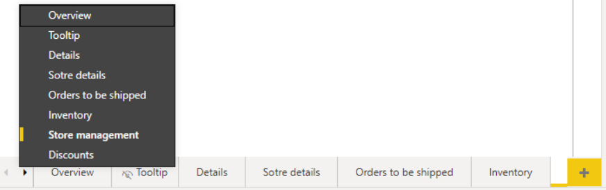
You have built a dashboard with a few pages and in order to navigate through pages, process seems to be very tedious as you have to click left/right arrows a couple of times in order to get to the page you are looking for.

What you should do is hover over those arrows and instead of clicking on them as usual, do a right-click and that will show you a list of all pages which you can click and go straight to the page you want. Remember, Power BI is part of Microsoft and it does have the same features like Excel.
Showing Slicers in horizontal format
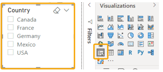
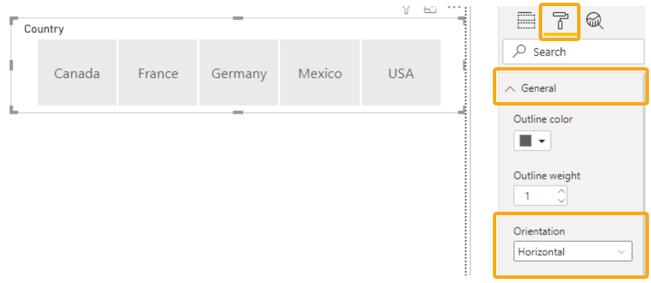
If you select a field which you want to show in a Slicer format, Power BI will automatically create a vertical list (in our case countries).
With Country visual selected, go to Format/General and then in Orientation field, change it to Horizontal
Format painter
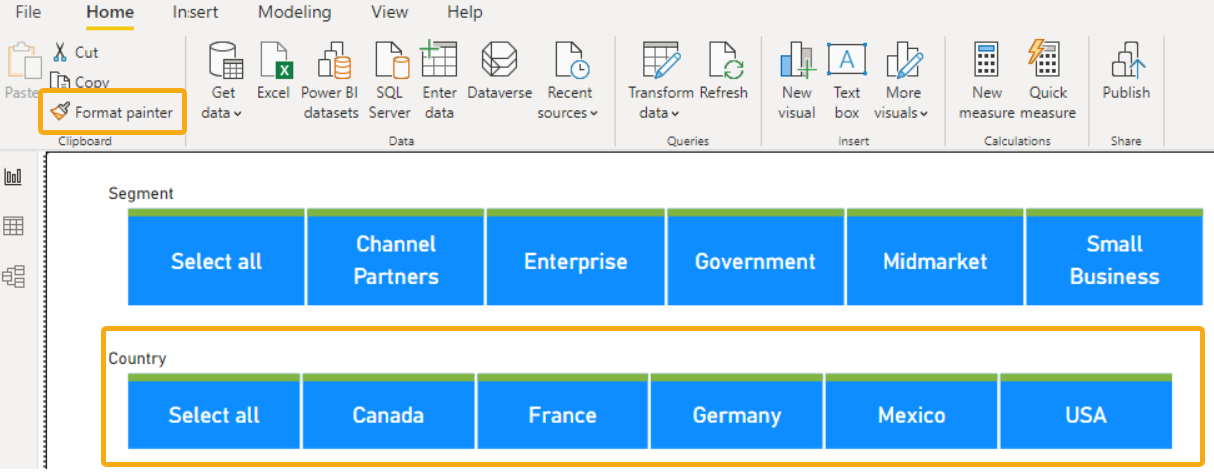
You have created the slicer visual you were looking for with the design you like for Segment. You want to apply the same design to another horizontal slicer which shows countries.

Instead of going through all the steps you went before to design Segment slicer, you can select Segment Slider, click Format painter in Home Tab and then click over Country Slicer visual. That will copy the same design format to the other visual. You can apply this technique for tables and any other elements in dashboard.
Show/hide Selection and Bookmarks pane.
You have opened all panes including Selection and Bookmarks Pane. If you are working in a dashboard those will take a lot of space in your screen and the workspace will be smaller. Fields and Visualizations have a little right arrow icon which minimizes them, however Selection and Bookmarks does not have any, besides the x which closes them entirely. Closing them entirely and adding them back again might be a very time consuming process.

A little trick which is not very intuitive but helpful in this case would be clicking over the Selection and Bookmark words which in turn will minimize those two panes. This should give you enough space to work on your dashboard.

Use Wingdings Font as icons
Although limited in the symbols you will get, there are plenty of them which might be useful for you when designing your dashboard. Insert a text box, choose Wingdings font and then start typing until you get the icon you want. For illustration purposes I have typed a few and I got the list below.
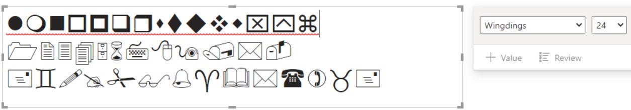
Let’s say you want to create a contact section, you can use those two icons to represent phone number and email as seen below.

That’s it for today. If you feel like you are in a mood to read more, check one of my previous newsletters How to build a Custom dashboard theme in Power BI.